Connecting Platforms
Simplified complex integration workflows into a modular system that reduced setup time and enabled non-technical users to configure connections.
Role
Product Designer
Scope
Integration Management
Team
PM, Engineering, UX Research
Timeframe
Q1–Q2 2023
The Challenge
Mapping fields between systems sounds simple — until you do it. Each platform has its own field types, labels, naming conventions, and data validation. We needed to design for flexibility across use cases without overwhelming users.
Integrations could be for very different use cases: form submissions, enrollment, assessments, and more. Field naming mismatches, authentication requirements, trigger-action mapping, and context-aware default values all added complexity. We had to make configuration feel approachable without hiding the technical reality.
“The same field might be called member_id in one system, user_external_reference in another, and id somewhere else.”
Context & Complexity
Integrations had become a key part of Medable's offering — but configuring them was messy, manual, and required escalation. We needed a way to make these complex workflows approachable, repeatable, and fast. Our goal: build a simple point-and-click interface for mapping integrations.
Field naming mismatches across platforms
Authentication requirements and security constraints
Trigger-action mapping with varying use cases
Context-aware default values for different integration types
Approach
Discovery & Alignment
Kicked off with whiteboard sessions, a FigJam workspace, and a shared Confluence doc to align on user goals. Reviewed engineering constraints and current behavior, then mapped out the most critical user flows and blockers. Landed on a modular, trigger-first interface designed to minimize configuration friction.
Initial Concept & Early Learnings
First concept aimed to show all integrations with a unified trigger configuration pattern. Usability testing uncovered: too much at once — users didn't understand what needed configuration vs. what was defaulted; trigger-first wasn't obvious — users assumed everything was already set up; no visual priority — key actions didn't stand out.
Second Iteration: Cleaning It Up
Clarified the user's mental model and gave structure to the page. Introduced clear section labels. Styled actions like Set Trigger and Map Fields as primary buttons. Moved the trigger field to the top of the workflow. By reducing clutter and guiding focus, users completed integration setup significantly faster.
Validation
Returned to user feedback frequently throughout — validating new concepts with real workflows before locking in the design.
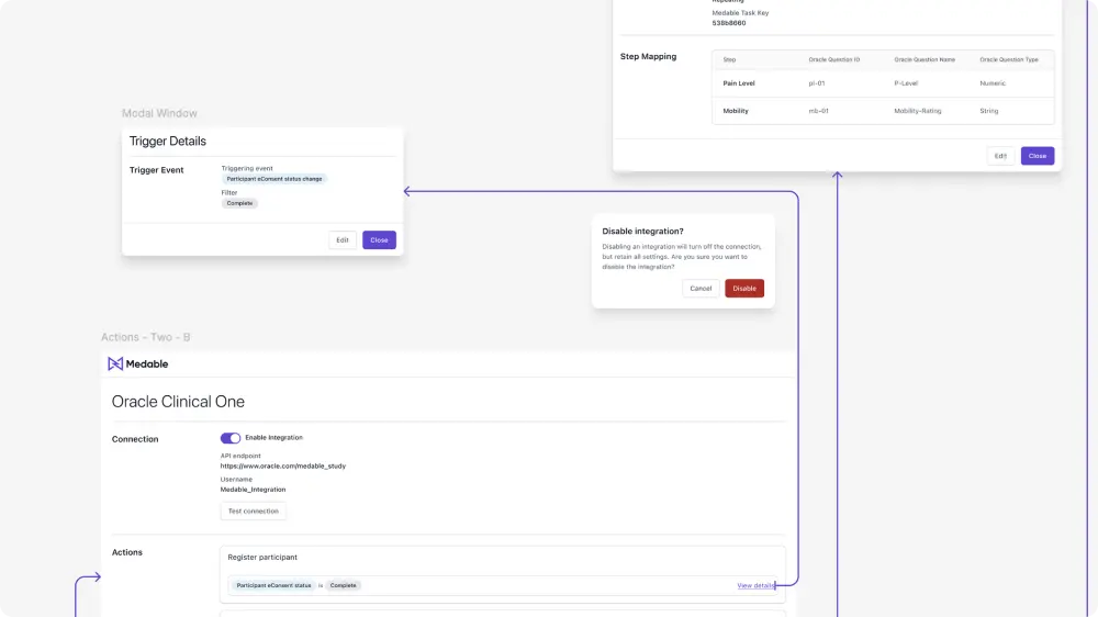
Initial concept
First concept with unified trigger configuration pattern — before usability learnings
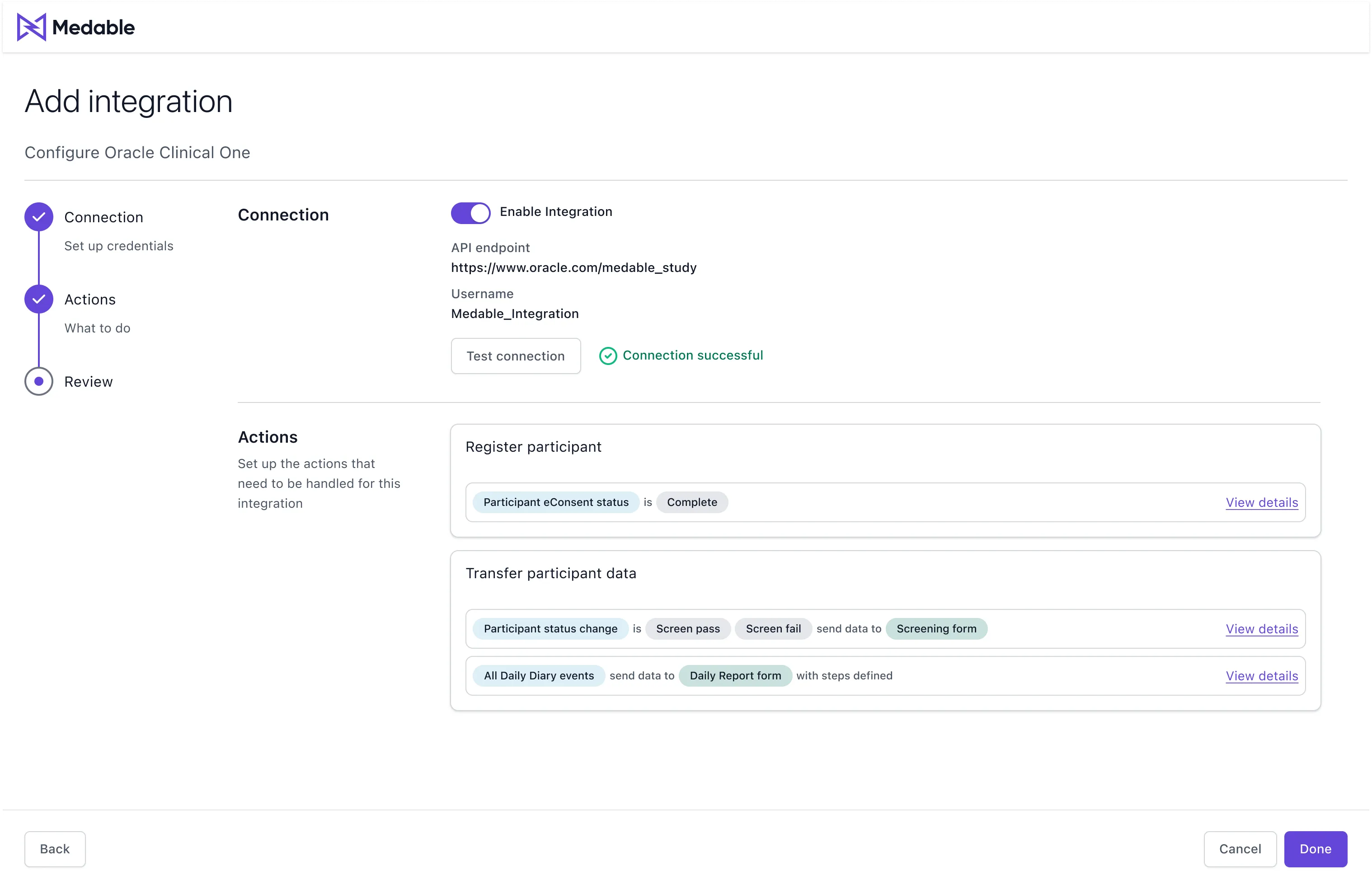
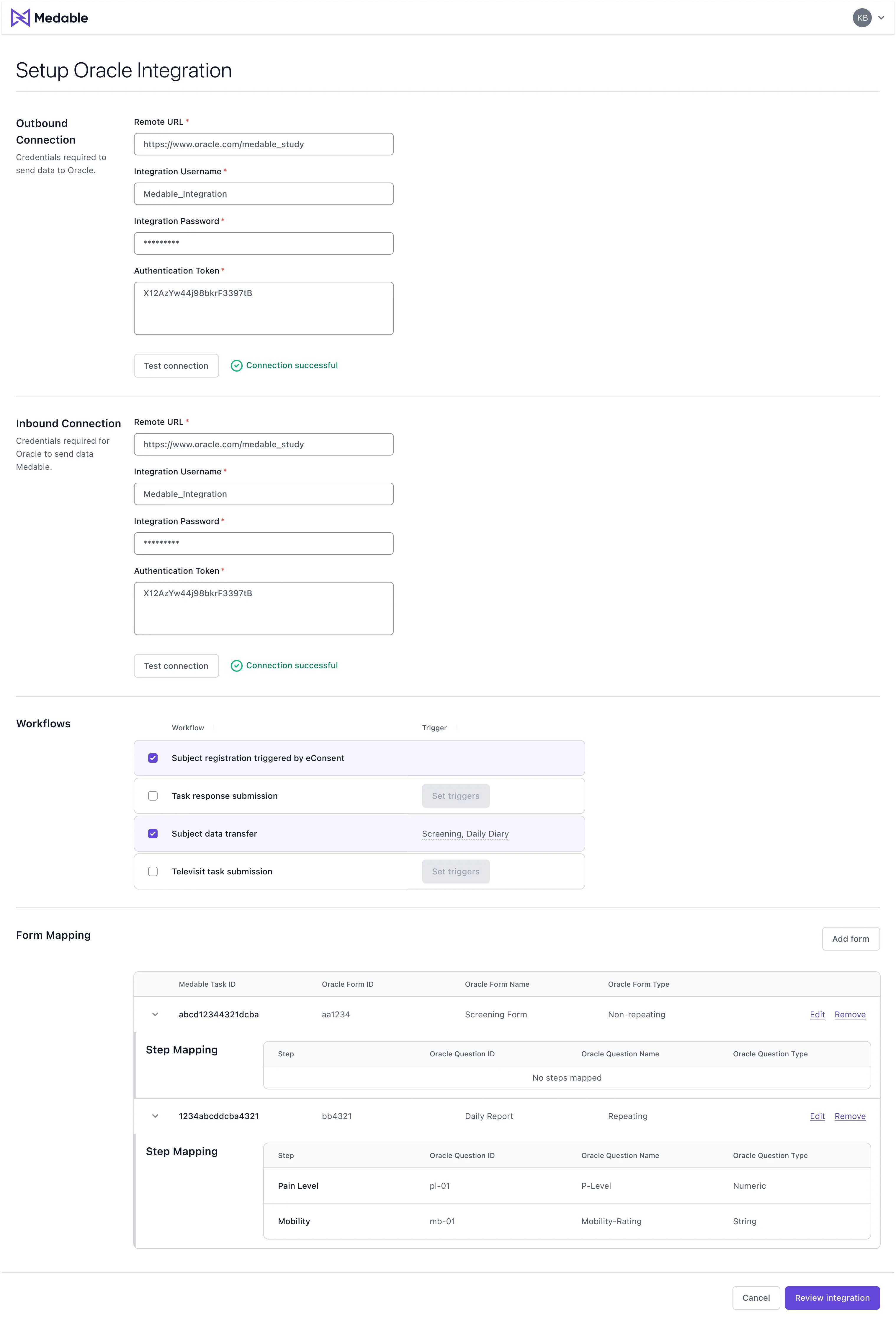
Revisited design
Second iteration with wizard workflow, clear section labels, and primary action buttons
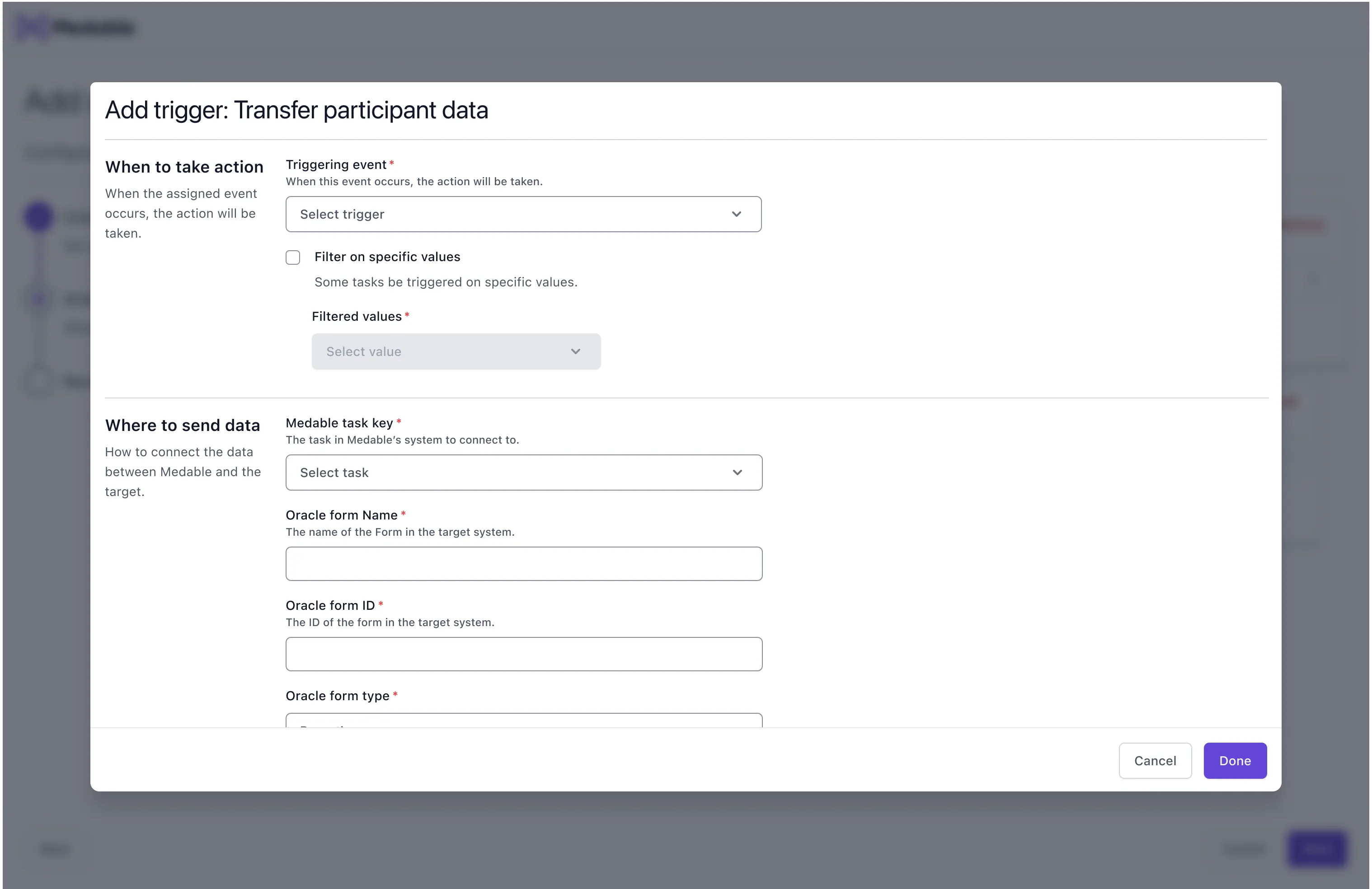
Add trigger modal
Example of adding a trigger to an action during configuration
Outcomes
Setup time: hours to minutes
The redesigned platform significantly reduced setup time and enabled non-technical users to confidently configure integrations.
Fewer configuration escalations
Stakeholders reported fewer escalations. RDs and support staff completed setups independently.
Modular, understandable connection model
Created a more approachable integration experience without hiding technical complexity.
What mattered most
By reducing clutter and guiding focus, we gave users control without overwhelming them. The trigger-first mental model and clear visual hierarchy were key. Good configuration UX makes technical complexity feel manageable without pretending it isn't there.
Next Case Study